If you read my most recent post in the FCP section, you will know that one of my briefs that we were given was a self promotion brief. In this brief we learn how to maket and promote ourselves as brands.
As part of this brief, we began looking at typography. I have always been interested in font as I think that font can really make or break a brand. Choosing the correct font is so crucial as it truly helps to convey the message you want to promote.
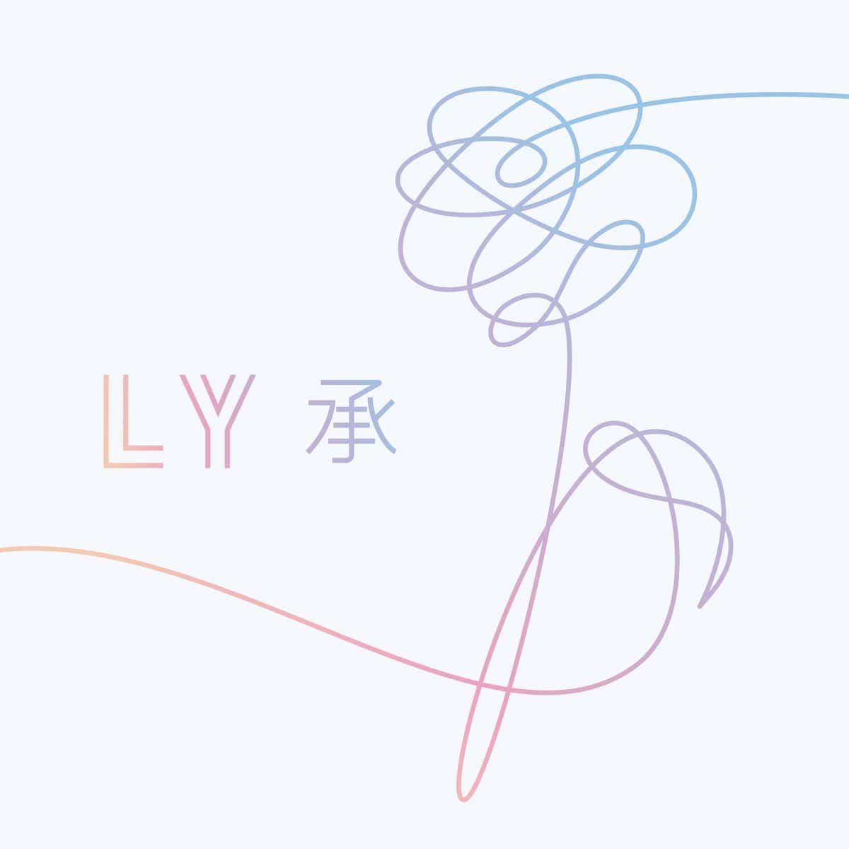
In our seminar, we were allowed to go around the streets near our FCP building to find different examples of typography. Since I couldn't attend the seminar, I decided to gather images of font that has inspired me. There are some primary and secondary images.Here is what I gathered:
 |
| PRIMARY IMAGE FROM TRUE FAITH EXHIBITION MANCHESTER |
 |
| PRIMARY IMAGE FROM NEIGHBOURHOOD BAR LEEDS |
 |
| DOUBLE LAYERED FONT FOUND ON TUMBLR |
 |
| REPETATIVE TEXT FOUND ON KANYE WEST'S 'THE LIFE OF PABLO' |
 |
| POST MALONE 'STONEY' |
 |
| 21 SAVAGE 'ISSA' ALBUM |
 |
| BTS 'LOVE YOURSELF HER' ALBUM ART |
After gathering examples of different typography, I got really inspired and decided to create some of my own. I used different settings on photoshop to achieve a variety of different outcomes. Here is some of my work:
 |
| 'GIRL POWER' SLOGAN - FONT INSPIRED BY DOUBLE LAYERED INSPIRED BY PREVIOUS TUMBLR EXAMPLE |
 |
| SOSTRESSD TUMBLR - USING MY TUMBLR NAME TO CREATE INTERESTING TYPOGRAPHY |
 |
| CREATING GLITCHY FONT ON PHOTOSHOP USING 3 DIFFERENT COLOURS, LAYERING THEM AND MOVING PIECES AROUND |
I hope you enjoyed this post! Thanks for reading.


No comments
Post a Comment