Friday 30 December 2016

Summative Brief

I can't believe that I have finished my first term at university already! It seems like just yesterday that I was sitting in the lecture theatre for welcome week and now Ive been given my first big individual project to complete over the christmas break.

The purpose of the summative brief task is to take us through each stage of the FCP process and see if we have learnt all the information given to us throughout the first term. We will be assessed on how well we can apply this information to a new task. It is a report document, that will include research into a fashion concept, developing a variety of Big Ideas, creating a set of mood boards, producing an image/ set of images to be used on social media. 

As part of the brief, we were given a trend to research. We had to look into the history and cultural influences of the trend, as well as the way that it has effected industries other than fashion. The trend that I was given was 'The Purist' trend. I had never heard of this trend so naturally I began to panic. So in order to come to terms with it, I decided to use Pinterest as this is a great way to visually research something. Creating a Pinterest board for the trend really helped as I was able to see exactly what my trend was. Overall, I collected over 150 pins. Here are some screen shots from my board:

DKNY resort collection S/S 17, Calvin Klein and Jil Sander designs

SHARE:

R.I.P| 3 beauty trends that we should leave in 2016


2016 was the year of excessive makeup tips and new 'trends'. Being a makeup obsessed teen who spends the majority of her money on makeup, I was excited for all the new trends and products being released. However, to my disappointment, half of the trends seemed like a complete waste of time. People have become so extra to the point that they are adding features they never had and reducing their body shape through excessive makeup. 

So I decided to pick three of the trends which I hated the most. 


1|Faux Freckles
Polka dots or faux freckles?


SHARE:

Wednesday 28 December 2016

The Execution stage pt 3 | Final idea and images


After lots of brainstorming, the next stage was  to come up with an idea for the shoot. Initially we wanted to use dance as the main theme since this was the main theme for Day's shoot. We first thought of doing it outside in the dark and using street lamps as lighting. Then we would have a model doing a dance pose and we would throw coloured chalk in the background to represent vibrancy and movement. Here are some of our brainstorms from this idea:


SHARE:

Friday 23 December 2016

The Execution Stage pt 2 | Photoshoot prep

So now that we know what our creative concept is, we were then given a product that we had to use as the main prop/theme of our shoot. We were given makeup, which meant that we had to incorporate this into our shoot somehow. Since I am makeup obsessed, I was ready and rearing to go. 

For the next stage, we needed to come up with 5 key words that we felt reflected the elements that were present within the original shoot, in order to inform our photoshoot. These words were:

Degraded Glamour

Isolation
Intimacy
Grunge
Raw

We chose 'degraded glamour' because we felt that the shoot was inspired by a french photographer called Brassai, who was known for capturing the dirty/gritty side of behind the scenes at dance shows in Paris. I felt that Day portrayed a similar vibe within her shoot as all of the images looked as though they were backstage before a show. 

The next word we chose was isolation. Looking at the photoshoot, there were a group of women but there was one main girl that was always staring into the camera whilst the others just looked like props. When I was analysing the shoot, I thought that the message within the original editorial was that despite the fact that many people can be included within a show, there is always a main star and the focus will always be on them therefore we chose this word. 


SHARE:

Wednesday 14 December 2016

The Execution Stage | Corrine Day style photographs

I was so excited to find out that Corrine Day was the photographer for the editorial we got and that we had to shoot in her style. I love Day's photography as there is always an element of rawness to the photographs as they aren't overly composed and unrealistic. As well as this, it looks like all of the subjects that Day photographs look like they trust her which means that the outcomes of the photos are very relaxed and not forced which add innocence and I think this is effective.
SHARE:

Wednesday 7 December 2016

Its a boy girl thing! | The evolution of the makeup industry


Benefit Babes! Patrick Starr, Kathleen Lights and Manny MUA (left to right)
Finally! The conventional and outdated stereotypes of mean and women within the beauty industry are being pushed aside thanks to the younger generation changing the way things are done by celebrating self expression and individuality.  After decades of it only being acceptable in society for females to wear makeup, the beauty standards are shifting with more and more males entering the makeup industry.
SHARE:

Wednesday 30 November 2016

The Execution Stage | Lets Dance!


After completing the first three stages of the FCP process, the most recent brief we have been set is the final step. The execution stage is the finalised outcome of all of the ideas that 

What we have to do:

Your team will be allocated a CREATIVE CONCEPT taken from existing editorial shoot from the Vogue Archive

You will visually analyse a Creative Concept and research the original shoot.

You will generate 5 words to inform the look of your photoshoot. These words will in turn reveal your interpretation of this Creative concept.

You will produce a series of edited photographs

The creative concept that my group was given was a series of editorial images that my group was given were shot by Corrine Day titled 'Lets Dance' featured in British Vogue 2004 and the fashion accessory that we were given was makeup.


SHARE:

Sunday 27 November 2016

The Creative Concept Brief pt 2 | Tyrell's Bycle Helmets

The next topic we are learning about is the creative concept stage of the FCP process, and we were given a brief so that we could show how well we understood the information we were being taught. The creative concept stage of the FCP process is the creative interpretation of the Big Idea from visual referencing. Throughout this stage, we will learn how to develop the skills in visual analysis and visual creation in more depth than what we have learnt from the previous briefs and stages. 

For the creative concept brief, the project was split into 2 tasks: 1 individual and 1 group. The individual task was to an individual written visual analysis of a fashion photograph which meant that we had to annotate, illustrate and reference. The point of this task was to help to increase our confidence and ability to analyse fashion images. I have written about this task in a previous blog post (here is the link:      ).
For the 2nd task, which was the group task, we had to create 3 mood boards communicating the creative concept of a collaboration between a well-known brand and an everyday product. This particular task required us to communicate what we learnt from the individual task that we created such as analysing skills, by analysing a brand and product as well as collecting and interpreting visual ideas and creating our own creative concept ideas. In this task we were advised to explore colour, shape and pattern and how these linked to the brand and product that we were given. Also the typeface and narrative and tone of voice was an important part of this task as it will influence the way in which a collaboration between the brand and product will look like. 
SHARE:

Thursday 24 November 2016

'Mirror, Mirror' - Paolo Roversi 2016

This week we were given our first independent brief, and to say the least I was more than excited. The brief was a visual analysis task and we were each given an image to analyse. The criteria of the task was to: 

Your task is to create a 750 word (+ or – 10%) visual analysis of one image. The document will contain references and illustrations as well.

You will deconstruct the image, analyse the visuals and interpret what you can see.

You can incorporate academic theory on decoding images and advertising, the basics of semiotics (the sign, connotation and denotation, context, the gaze), discuss any cultural references (links, connections, influences), and bring your own interpretations.

The image I was given was a picture taken by Paolo Roversi in 2016 as a part of a promotional shoot for Dior's SS 16 collection to put into their magazine. At a first glance, I was unhappy with my image as I thought that it would be extremely hard to analyse as it looked quite simple and uninteresting. However, after we completed various exersizes in the seminar I became more optimistic as I saw elements from the image that could be symbolic and have meaning behind them. 

SHARE:

Sunday 20 November 2016

Big Ideas Brief | My Campaign

For out second brief, we focused on Big Ideas and ethical issues within fashion. The itinerary for this brief was to:
Develop an idea that raises awareness of the environmental and ethical problems caused by the global fashion industry that suitable for NTU students. 

With this information in mind, I began my research. 

Secondary research

One  article I found from www.campaignlive.co.uk said that  “Social media marketing has been top of mind for brands targeting 18-24s. Brands have learned the importance of transparency, relevance and shared conversation versus traditional push approaches. We know young people are big users of social media - 97% in our recent survey use Facebook and 45% are on Twitter.” Being a student myself, I am an avid user of social media and I think that brands that use this platform to promote their brand/campaign is effective because it allows consumers to be able to interact with their favourite brands. 

SHARE:

Wednesday 16 November 2016

Big Ideas Brief | The True Cost

Image result for the true cost
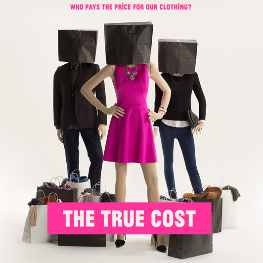
'The True Cost' poster

Yesterday, we were introduced to our new topic for the next few weeks which is all to do with 'Big Ideas'. To ease us into the subject and help us to gain more of an understanding about what we are going to be covering, we watched a documentary called "The True Cost". 

The True Cost was a documentary made to make consumers aware of who really makes the clothes we wear as well as who really has to pay the price. It focuses on fast fashion and the reasons why they are able to price their clothing at ridiculously low rates.


SHARE:

Friday 28 October 2016

Frill Finish | Trend Brief - Part 2

So as you saw from my previous post, I completed the part 1 of my first trend brief. I was really happy with the information that I sourced and as a group, we worked well together. All that was left were the third and fourth mood board which were 'retail' and 'consumer'. Unlike the first two boards, these required primary research. This meant that we had to go out and find the information for ourselves more than using secondary sources such as the internet and books.

Mood board 3 - Retail
For this mood board, we thought that it would be best to split it into high end and low end, as it seemed the most natural way to do it. 

High End 

Since none of my group went onto the London trip due to unfortunate circumstances, we found it very difficult to find examples of frills in high end retailers therefore I did my research for this online. When I began to see how frilled detailing translated into high end retailers, I noticed that the maximalism found on the catwalk was replicated in high end stores. As you can see from he images above, unlike high street stores, in high end retailers, frills are featured on many more items of clothing such as jeans and coats. 

SHARE:

Sunday 16 October 2016

Frill Finish | Trend Brief - Part 1


During our first month of the course, we were given our first brief, which focused on a popular trend in AW 16/17. The trend that we were given was 'Frill Finish'. This was from frills on clothing to accessories. 

Once we were given the brief, we were divided into groups. I was placed in a group of 5 girls, however 2 of them didn't show up therefore there were only 3 of us in the end. Initially we thought that it would be difficult to find enough material for each mood board. We had to create and present 4 mood boards in total. The 4 areas that we had to create our mood boards on were: 

Trend
Media
Retail
Consumer. 

SHARE:

Thursday 6 October 2016

What is Fashion Communication and Promotion? | Why I chose to study this aspect of fashion.

Image from Google

If you have read my previous post, you will know that I have just recently started studying Fashion Communication and Promotion at Nottingham Trent University and I am loving every minute of it. Throughout the last two weeks I have really gained an understanding of what I am going to be studying over the next three years and essentially, what I am getting myself into. The most crucial thing that I have learnt over these weeks is exactly what Fashion Communication and Promotion is. 

Often when I tell people the course that I am studying, they instantly assume that I am going to spend three years of my life sitting at a sewing machine slaving away for hours on end. However, I think people need to be more aware that there is more to fashion than 'making clothes'. Fashion Communication and Promotion is an abundance of things but mainly is the activity that supports the promotion of fashion products
SHARE:

Friday 30 September 2016

Cultural Appropriation | Marc Jacobs S/S 17 NYFW

Cultural appropriation is very common within the fashion industry and many consumers are unaware of this. Especially nowadays, lots of designers and celebrities are taking cultural elements from a minority and claiming that this is an idea created by themselves, without acknowledgement of where the inspiration came from as well as the history behind it. 

Marc Jacobs SS 17
White models at the Marc Jacobs S/S 17 show.

A recent incident of this that made major headlines was Marc Jacobs show at New York fashion week for his Spring/Summer 2017 collection. Since Marc Jacobs was closing NYFW, all eyes were on his collection therefore it was hard for anything to go un-missed. Overall, the show was outstanding. A clan of models stomping down the runway in formation whilst sporting velvet hot pants, pastel coloured fur and dangerously high glittery platforms - what more could you ask for. 

SHARE:

Sunday 25 September 2016

Pantone Colour of the Year : Rose Quartz and Serenity


For this year, Pantone have decided to select two pastel colours      for their colour(s) of the year. Not only is it uncommon for Pantone to select two colours, but also this is a softer take on colour than Pantone is used to. 

On Pantone's website it states:


As consumers seek mindfulness and well-being as an antidote to modern day stresses, welcoming colors that psychologically fulfill our yearning for reassurance and security are becoming more prominent. 


Joined together, Rose Quartz and Serenity demonstrate an inherent balance between a warmer embracing rose tone and the cooler tranquil blue, reflecting connection and wellness as well as a soothing sense of order
SHARE:
Blogger Template Created by pipdig